Difference between revisions of "Viewport, dashboard and desktop icons"
m |
m (→Desktop icons) |
||
| Line 239: | Line 239: | ||
=Desktop icons= | =Desktop icons= | ||
At the upper edge of the viewport you can find so-called desktop icons organized in two icon bars. | |||
===Global Action Set icon bar (right)=== | |||
The right icon bar is showing icons from the "Global Action Set". The Global Action Set is always available and the default should look similar to this: | |||
[[File:Global Action Set default icon bar.png]] | |||
The Global Action set is customizable: | |||
* Actions can be added to and removed from the action set | |||
* Actions can be mapped to keys | |||
* Icons/buttons can be added removed from the screen | |||
For further information about customizations please refer to [[Keyboard Mapping]]. | |||
===Current Action Set icon bar (left)=== | |||
The left icon bar is showing icons from the currently selected action set. By default (when first starting the game) Action Set 1 is selected and the default icons should look similar to this: | |||
[[File:Action Set 1 default icon bar.png]] | |||
Each action set is customizable: | |||
* Actions can be added to and removed from the action set | |||
* Actions can be mapped to keys | |||
* Icons/buttons can be added removed from the screen | |||
For further information about customizations please refer to [[Keyboard Mapping]]. | |||
===Action Set Selector=== | |||
[[File:Action Set Selector.png]] | |||
The first (left-most) button in the left icon bar is independent from any action set and has special features. | |||
The left and right arrow can be used to change the active action set. In total there are 10 selectable action sets available and the number of the currently selected action set is displayed between the arrows. | |||
The 3 little rectangles in the top left corner of the already little button take you to the [[Action Library]] from where further actions can be selected. | |||
For the sake of completeness: The little questionmark in the top right corner of the button open a brief explanatory text. | |||
=Links, references, contributors, categories= | =Links, references, contributors, categories= | ||
Revision as of 00:23, 27 July 2013
| |||
Latest Forum Threads
Find more in the Tutorials, Guides and Help forum section! |
This guide introduces the structure and features of the Entropia Universe viewport, dashboard (HUD) and the standard icon bars.
This page is part of the general Entropia Universe Guide and also referred to in the Entropia Universe beginners guide.
If the guide pages didn't answer your questions you can always ask on the forums http://www.entropiaplanets.com/forums/tutorials-guides-and-help.22/
Viewport
1st person/3rd person
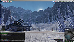
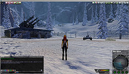
In Entropia Universe there are 2 basic access modes: 1st person view and 3rd person view. You can toggle between them using the mouse wheel.
| First person view | Third person view | |
|---|---|---|
|
| |
| Avatar | not visible | visible |
| Crosshairs | visible (press N to toggle style and visibility) | not visible (press N to make visible) |
Viewport, dashboard and desktop icons
Dashboard / Heads-up display (HUD)
The so called "dashboard" is mainly what is commonly known as Heads-up display (HUD) in video gaming. The dashboard features different panels each of which provides a set of information and features. The standard ones are usually to be found at the bottom from left to right:
Each of the panels can be moved around by drag'n'drop operations, the chat panel and the radar panel can be adjusted in size, and the complete dashboard can be hidden.
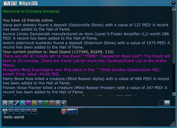
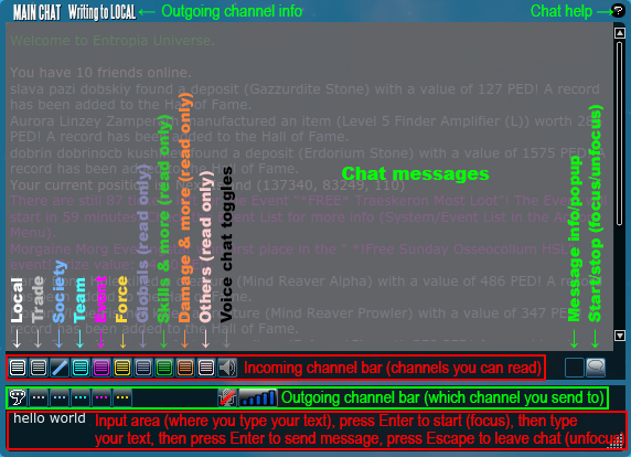
Chat panel
Modes for "incoming" channels
Modes for "incoming" channels
 Selected - this is the channel you currently send messages to
 Unselected - your messages are NOT send to this channels
How to chat
- Start chatting (focus the chat window) by pressing ↵ Enter or click the Start/Stop chat icon

- Optionally switch the channel by clicking one of the channel icons or using a key combo (see chat channels section just below)
- Type the message
- Press ↵ Enter to send the message
- Stop chatting (unfocus the chat window) by pressing Esc or click the Start/Stop chat icon

Chat channels
| Channel | Key | Directions | Requirements | Description | |
|---|---|---|---|---|---|
| Local | /l | Read/write | none | The local channel is for communication with all players in close proximity to each other. | |
| Trade | /tr | Read/write | The trade channel works like the local channel but should only be used for trading. | ||
| Society | /s | Read/write | Society member | The Society channel is used for private communication among Society members. | |
| Team | /t | Read/write | Team member | The Society channel is used for private communication among team members. | |
| Event | /e | Read/write | Active event | The Event channel is used for private communication among participants of a specific event and also by the event system for general automated event information. | |
| Force | /f | Read/write | Etheral Soul Language | The force chat channel can only be used by players who have unlocked the hidden skill Etheral Soul Language | |
| Globals | n/a | Read only | The globals channel is used by the system to display global messages. | ||
| Skills | n/a | Read only | The "skills" chat channel is used by the system to display skill related messages (like skill gains) for the individual player. | ||
| Damage | n/a | Read only | The "damage" chat channel is used by the system to display damage related messages for the individual player. | ||
| Others | n/a | Read only | The "Others" chat channel is used by the system to display various kinds of messages for the individual player, for example players on one's friendlist joining/leaving the game. | ||
| Voice chat | n/a |
Status panel
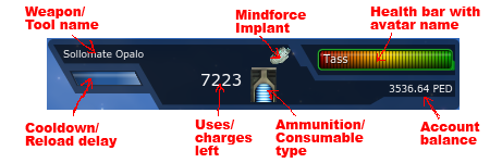
The status panel is another element of the dashboard that contains important information like you health condition, PED balance, ammunition/consumables left for use, status effects and more. Usually (default) it can be found just left of the radar panel at the bottom of the viewport bit it can be moved anywhere else by drag and drop.
Depending on status effects, equipped items, etc. the panel can look quite simple or quite filled.
Health bar
Showing your remaining health in relation to the total. The health bar also has a "Use tool" feature, meaning when you double click the health bar the currently equipped tool or wepaon is used once.
Avatar name
Inside the health bar the name your avatar currently displays is written in white letters. You can change the combination of first name, nick name and surname to display by right-clicking anywhere on the screen -> "My Avatar" -> "Avatar Name".
Account balance
Below the health bar a number displays your account balance in PED
Mindforce Implant
If a Mindforce Implant is inserted a small icon is displayed left of the health bar.
Weapon/Tool
If a weapon or tool is equipped the name of the item is displayed in the top left area of the status panel.
Reload delay
If a weapon or tool is equipped the "reload delay"/Cooldown is displayed as a progress bar just below the items name.
Uses or units left
Right of the reload delay display (if a weapon or tool is equpped) there's a number displaying one of the following:
- left number of ammunition/consumables for the equipped tool/weapon
- number of uses left (before ammunition/consumables are down to 0) for the equipped tool/weapon
You can toggle between the two options int the options menu by pressing O -> "HUD" -> "Show shots left" either checked or unchecked
Ammunition consumables type
Right of the display of uses/units left an icon shows to type of ammunition/consumable the currently equipped item needs.
Radar panel
Moving the radar panel
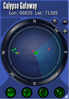
The radar usually can be found in the bottom right corner of the screen (it can also be moved to another postion by drag'n'drop).
Location and position
At top the radar is showing the name of your current location, fx the name of the Planet or destination or instance. Below that it is showing your current position as a Longitude and Latitude value.
Radar modes
The left-most little button above the top right section of the actual radar toggles between ??? mode and ??? mode, meaning whether north is always at top or your current view direction is always at top.
Changing the radar range
The little plus and minus buttons above the top right section of the actual radar are used to zoon in and out, respectively changing the range of the radar.
Dots on the radar
The actual radar assumes the avatars position in the center and is showing directions as well as avatars, creatures and facilities represented by "dots" (actually tiny squares) of different colors. Besides the tiny squares there are also actual dots which are a little bigger and circled by a dashed line - these are representing waypoints. "Dots" (tiny squares) and their meaning:
- Green - Other living avatars.
- White - Other dead avatars
- Purple - Other avatars in the same society as you
- Yellow - Other avatars in the same team as you
- Red - Living creatures
- Dark blue - Carcass of creatures
- Light blue - Teleporters
- Orange - Non-player characters (NPCs).
- ??? - Televator?
Info signs on the radar panel
The bottom row features 4 different signs with the following meaning (from left to right):
![]() PvP zone - Indicates a zone with Player-versus-Player combat (PvP) enabled (Tip: Stay away from PvP areas as long as you don't exactly know how PvP combat works).
PvP zone - Indicates a zone with Player-versus-Player combat (PvP) enabled (Tip: Stay away from PvP areas as long as you don't exactly know how PvP combat works).
- green - you are not in or close to a PvP zone
- orange - you are very close to a PvP zone
- red - you are in a PvP zone
![]() Toxic zone - Indicates a zone with Player-versus-Player combat (PvP) and looting of other players enabled (Tip: Stay away from PvP areas as long as you don't exactly know how PvP combat works).
Toxic zone - Indicates a zone with Player-versus-Player combat (PvP) and looting of other players enabled (Tip: Stay away from PvP areas as long as you don't exactly know how PvP combat works).
- green - you are not in or close to a PvP zone with looting
- orange - you are very close to a PvP zone with looting
- red - you are in a PvP zone with looting
![]() Vehicles allowed in the area - Indicates whether or not vehicles are allowed in the area
Vehicles allowed in the area - Indicates whether or not vehicles are allowed in the area
- green - you are in an area in which vehicles are allowed
- orange - you are very close to an area in which vehicles are not allowed
- red - you are in an area in which vehicles are not allowed
![]() Allowed in the area - Indicates whether or not you are not allowed to be in the area (An area in which you are not allowed to be could for example be an event area during the time of an event for which you don't have a ticket.)
Allowed in the area - Indicates whether or not you are not allowed to be in the area (An area in which you are not allowed to be could for example be an event area during the time of an event for which you don't have a ticket.)
- green - you are in an area in you are allow to be
- orange - you are very close to an area in which you are not allowed to be
- red - you are in an area in which you are not allowed to be
Desktop icons
At the upper edge of the viewport you can find so-called desktop icons organized in two icon bars.
Global Action Set icon bar (right)
The right icon bar is showing icons from the "Global Action Set". The Global Action Set is always available and the default should look similar to this:
The Global Action set is customizable:
- Actions can be added to and removed from the action set
- Actions can be mapped to keys
- Icons/buttons can be added removed from the screen
For further information about customizations please refer to Keyboard Mapping.
Current Action Set icon bar (left)
The left icon bar is showing icons from the currently selected action set. By default (when first starting the game) Action Set 1 is selected and the default icons should look similar to this:
Each action set is customizable:
- Actions can be added to and removed from the action set
- Actions can be mapped to keys
- Icons/buttons can be added removed from the screen
For further information about customizations please refer to Keyboard Mapping.
Action Set Selector
The first (left-most) button in the left icon bar is independent from any action set and has special features.
The left and right arrow can be used to change the active action set. In total there are 10 selectable action sets available and the number of the currently selected action set is displayed between the arrows.
The 3 little rectangles in the top left corner of the already little button take you to the Action Library from where further actions can be selected.
For the sake of completeness: The little questionmark in the top right corner of the button open a brief explanatory text.
Links, references, contributors, categories
- Guide: Keyboard Mapping
Contributors:
|
